explore now
Save big on my go-to tools & tech
Fav Tools

tune in now
Tune into the top rated podcast for practical strategies and candid conversations with entrepreneurs
podcast
The Emily Osmond Show




learn more
I’m an international marketing coach, top-ranking podcast host, speaker, interiors lover and black coffee drinker.
Hey, I'm Emily


How to create a high converting website in 2023 with Emma Troy
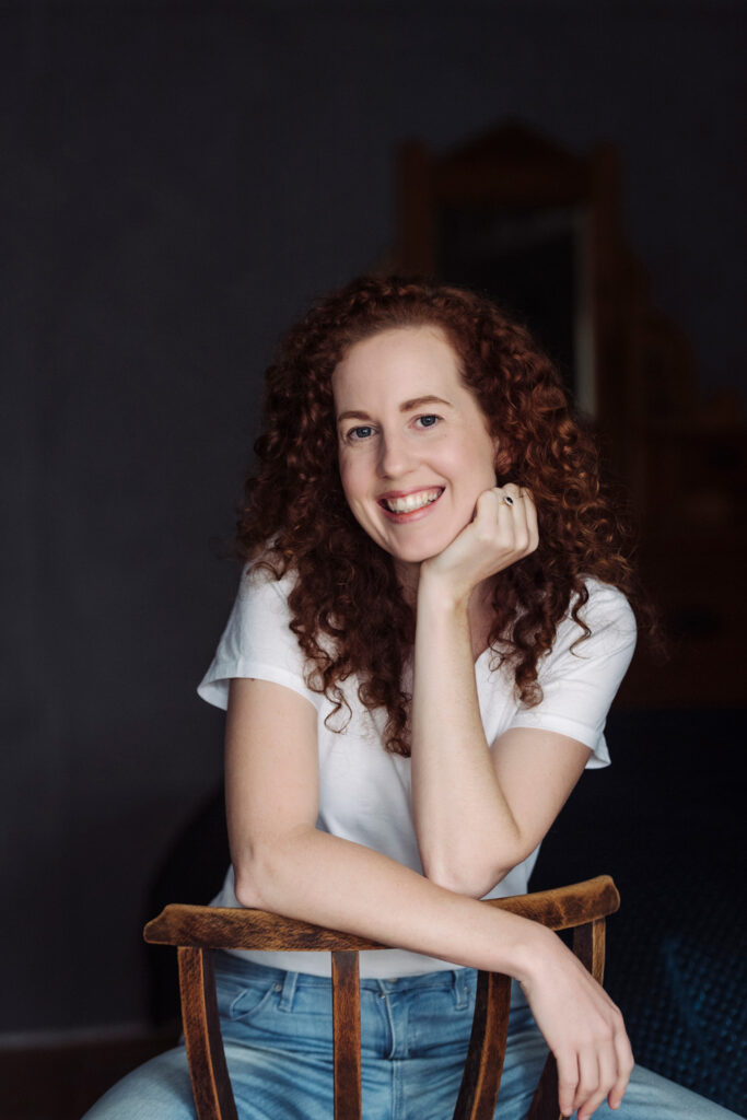

Welcome to the world of web design in 2023, where creating a high-converting website is crucial for online success. We’re so lucky to be joined by Emma Troy to help decipher the must-haves and what to avoid to create a converting website machine for your service or product-based business!
INTRODUCING EMMA TROY
Step into the digital realm where creativity meets technology, and websites come to life with captivating designs and seamless functionality. Meet Emma Troy, the brilliant designer behind Emma Troy Designs, a creative powerhouse specializing in crafting stunning websites that leave a lasting impression.
Emma Troy is an exceptional web designer and Showit design partner for creatives, coaches and entrepreneurs, and adventurers. Emma has a remarkable ability to blend artistic vision with technical expertise and has helped me design my very own website. Through her work, she invites you to embark on a journey where aesthetics and user experience combine to create websites that are visually captivating, high-converting and user-friendly.
WHAT IS A HIGH-CONVERTING WEBSITE?
Emma explains a high-converting website is when a user on your website is compelled to take action, so they’ll click a button in the hope to book, buy, download or learn more. Ultimately it’s the end goal of a website. A conversion-optimised website is a clever combination that mixes design with psychology and conversion optimisation – this is the brains of your website. It’s super important to think about the user experience whenever a potential client is surfing through your pages because it’s the magic dust that makes your website really visually appealing and consistent with your brand.
WHERE DO I START?
Emma walks you through the essential steps to create a website that not only captures attention but also converts visitors into valuable customers. She is the absolute best at this because she is helping her clients every day to transform their boring brands and bland websites into magical money-making masterpieces.
Emma will walk us through all of the dos and don’ts when building your website to encourage your clients to spend more time on each page and click on each Call to Action button.
So if you feel stuck when deciding what to include on your Home page, what to write on your About page, how to design your Offers page, how to stay consistent with your brand and colours, and what your Navigation pane should look like – tune in because Emma is filling us in on everything you need to know to create a high converting machine.
And remember, Emma has truly beautiful templates on her website that you can check out that are super easy to use and will make your website look incredible with very minimal effort on your part!
So, grab a cup of coffee and let’s dive in.
LINKS:
Where to find Emma Troy:
Website: https://emmatroy.com.au/
Instagram: @emmatroydesign
Check out Emma’s Showit templates here, and use my affiliate code VIPEMILY for $100 off your purchase.
[00:00:00] Emily: Well, welcome everyone that’s tuning in. Hello. Hello. I thought we may as well start recording. I have Emma Troy here who is a wonderful web designer, brand designer, and also a mom to your gorgeous Matilda. How old’s she now, Emma? She is she just gone one?
[00:01:03] Emma: She will be one in a couple of weeks. So we are, we are close. We’re close to that first year milestone.
[00:01:11] Emily: Amazing. And we were just saying, so your husband is with Matilda, Coden’s with Lando and I thought we might as well hit record and talk cuz what did you do? What’s your first year been like? Emma, first baby, first year of having a business, having Matilda. What has that actually looked like? Give me insight. I’m halfway through Lando’s six months.
[00:01:30] Emma: Absolutely. So I was super organized, prior to Matilda arriving and having a lot of content already created. So I had a lot of people say it was like, you, didn’t even leave. So that was good the first few months and I thought I would be back at work within three months. But first baby, I think you think yeah, it’ll be fine. We’ll have a routine in place by then, and, and I did, but I just wasn’t, I wasn’t ready. Um, Matilda is an incredible, easygoing baby and she’s slept through from six weeks, so I’m very lucky.
[00:02:03] Emily: Oh my, can you please teach Lando? He’s still not doing that.
[00:02:07] Emma: I, yeah. Okay. Well, I, think she was probably always going to be a good sleeper, but we used this, I got this bassinet called the snoo. I don’t know if you’ve heard. Yeah. I feel like that probably helped with the sleep training. And then we’ll just really strict if it was just me, there’ll be so many times that I would’ve gone in and just picked her up. But I would stand at the at the door and Caleb’s like, don’t do it. Don’t do it. So in saying that, I could have been back at work a lot earlier, like if I wanted to work nights because, she slept through night. But I just wanted that time to myself. I wanted that time for Caleb and I and even though she slept through the night, I was still really tired. So mums that are up multiple times through the night doing feeds, for the first six 12 months or beyond that, I know there’s a lot of mums that their little ones don’t sleep through for many months, even beyond that first birthday. Like they must be exhausted. But I mean, I was still have been still exhausted, so I just didn’t wanna push myself. And I kept hearing about all the, these things called sleep regressions and I was like, this won’t last. This sleeping through won’t last. And I didn’t want to pack my schedule and then, yeah, hit, hit a sleep regression and it’d just all go backward. And that never happened. But I just, yeah. I wasn’t ready for client work or anything. Too much I think. But I must say I was ready for something very early on. I feel like I needed just something other than folding, washing and, and caring for this little baby, I felt like I needed to tick something off my own list. So even if it was just 20 minutes a day to do some bookwork or work on a little bit of marketing or be creative, I didn’t realize how much. Like how important my work was to me and that creativity as an outlet. I remember trying for a baby and, it took us a little while and I was like, I’m just so ready for these teddy bear picnics and to give, to have a big break from work. Like, I’m tired. I’ve been doing this for many, many years. And then it’s funny. Once then you are a mum. Yeah. I’m like, no, actually I do need work. I don’t know if that’s been the same for you. We’ve had a few conversations that I, I remember you saying you missed working
[00:04:26] Emily: I miss work. It’s interesting. Cuz I was the same, I think. I don’t know what it was, but I’m like, yeah, three months, like I had my content. Pretty organized. Podcast, pretty organized. And then I, I don’t really know what I, I think I was thinking, okay, then childcare or maybe a nanny or something.
[00:04:41] Emily: But I, I don’t think, I don’t know, cuz he’s six months now. I don’t really know what happened the last three months, but I think I probably, I wasn’t, I don’t know, it just felt so like hectic and full on around that time and he was changing so much and I don’t think I was kind of even thinking, right, we’re ready to go and childcare or nanny at that point, the last few months.
[00:05:02] Emily: And, and I think actually at that three month part, that’s when I was like, right, Coden, let’s map this out. Let’s get our weekly schedule happening. You have him here. I have him here. We’re both self-employed, work from home. But that has been challenging cuz I think it’s a little bit like, well if one of us has him, the other one is working, but we both kind of wanna be working a bit and I don’t know. So now I, I am like probably gonna get him started at childcare next, in the next couple of weeks just for probably, well, I think two days is the minimum that they’ll take. So two days a week and they’ll be my two work days.
[00:05:35] Emily: It’s like I’ve always wanted to be a mom. I’ve had that part of me and , it’s amazing, but it is relentless. And I also kind of go back and forth between, well, hang on. This is all that I’ve like, this is what I’ve always wanted and now I have it, but I also have my business. And that is more than money to me. It is that creative outlet and that ideas, and it just fulfills me. And it’s just, I don’t know, I think right. I, I can’t do both full-time. And I think with my business, it is set up in a way that it doesn’t need me full-time in terms of 40 hours a week. And I have that intention that it will, I’ll always pretty much work part-time hours with it And then have like days with children and I don’t know if that makes sense,
[00:06:27] Emma: Yeah. Absolutely. And I think it’s great that like Coden has his own thing going on as well, so you can manage your schedules,
[00:06:36] Emily: Oh my gosh. So lucky.
[00:06:37] Emma: Caleb Caleb and I are doing. So Caleb used to work at sea, so he’d be away five or six weeks at a time, and then home, five or six weeks. Which, knowing that. I always wanted children. It took a little bit more convincing for, for Caleb, but a and a big part of that was probably, well, how is this going to work when my job is, I’m away half the year? And we were just lucky that we’re in a position my business was going really well, and it didn’t need a lot of me that he was able to take a big chunk of time off and be home with me throughout my pregnancy, throughout the birth of Matilda. And then it’s given him time to start his own business here. And it just means we can balance our schedules because we don’t, we don’t wanna do daycare yet. We we’re out in the country, so daycare’s a little bit harder. You have to then travel to I’ll have to take Matilda somewhere and it just kind of eats into your day a little bit. But we do have Caleb’s mom’s super close. So his parents are a little bit older and they live, they have a cottage on our property, so it’s super handy. But in saying that, I’m not even utilizing that probably as much as I should. I just feel bad. Like I just, cuz I wanna be with my baby, but then I also want to, I wanna work as well. It’s a hard balance, but I think if you can get that time scheduled in so that when you’re with your baby, you’re not feeling anxious about work.
[00:08:01] Emily: That’s the thing. Hey.
[00:08:02] Emma: Yeah.
[00:08:03] Emma: One, once we got a little bit of time scheduled, scheduled in, even if it was Caleb just taking her for an hour in those early days, just knowing that I had that hour coming up and then I could just really enjoy the time with her and not worry or get frustrated that, have an idea and think, oh, I’m not, I can’t, I need to, go and fulfill this idea, or, yeah.
[00:08:24] Emily: And what’s It, like for you now? Em, business wise?
[00:08:28] Emma: Well now, now that she’s a bit older, It’s much easier, and I feel like we’ve got our schedules balanced a lot better. I introduced VIP days, which-
[00:08:38] Emily: Which I’ve done one of. Loved it. Yes.
[00:08:42] Emma: -So it just means that day kind of locked away in my studio working is much better than spreading the, the workout over a week. I can just lock myself away, and it means it’s, it’s one day out of Caleb’s schedule as well. It’s not like, three or four afternoons in the week, like little tidbits. It’s just, it’s easier for us to organize. And it’s, they’re great. It’s a, it’s a big day and I get up really early and, but I, I love the challenge of it. It’s been great in terms of the challenge and I’m actually really productive and I doing them, I’ve realized how probably unproductive I was prior to having a baby cuz you have too much time.
[00:09:27] Emily: I, and I, knew it. I did know it at the time, but I’m like, crap, I could have done so much more.
[00:09:33] Emma: Yeah, I just get so much done in that day because you’re super focused and hey, like this time we’ll run out at the end of the day, it’s only a v i p day. Whereas before when I had a full week to work on, numerous projects I probably just wasn’t great with my time. I think parenting is really great for time management.
[00:09:51] Emily: Totally. And I can relate Em just with I can see how that would work really well, having that focus day where it’s like, right, this is my work day. I’ve got, whether it’s Caleb or someone to look after Matilda. And it just works well cuz I’ve found that when I go out and do my speaking gigs, I’ve done, I think, well, I had one in Sydney for two days, and Coden and Lando came up to Sydney and they hung out together and I did the speaking gigs. And then I’ve had a couple of others where I’ve gone out and I’m like, this is, this works really well. Like, we get it in the diary, I’m away so I’m not kind of getting sucked into things at home or all that. I go out, I do it, and then I come back and I’m like, this works really well.
[00:10:32] Emma: It does, it does. I think, yeah, because it, it has been challenging at times, like when I’m still here and, and Matilda’s here and I’ll want to just go and see her and then I probably disturb things a little bit cuz you know, she can get a little bit sooky for me. But, it’s just great having, I think, a really awesome partner. It sounds like Coden is great. Caleb will often, he’ll, he’ll just say, I’ll take her so you’re not disturbed. You know, he’ll take her to do the shopping or for a drive or, to visit his mom or something like that. it’s, it’s, Yeah. it’s just good. I think if you’ve got a really good partnership there and yeah
[00:11:07] Emily: Mm. Oh good. Em, I look forward to staying continuing the conversation around that. I like to look, okay, who’s a bit ahead of me, what can I learn from them? What are they doing, what’s working? And yeah. So thank you for sharing.
[00:11:19] Emma: Yeah, no worries.
[00:11:21] Emily: Well, the reason I asked you on today was to talk with you about life, everything. But specifically around websites, I might get you first of all, em, do you wanna introduce yourself and just share what it is that you do, what you offer, what you love helping other people with through your business.
[00:11:40] Emma: Sure. So I’m a brand designer and a website expert, and I’m a Showit design partner for creatives, coaches and entrepreneurial, adventurous. So I help I help people, I guess, really transform their boring brands and bland websites into nearly magical money making masterpieces. So I love conversion and I’m quite passionate about that. Plus, I really love visual storytelling and really creating, I guess these immersive online experiences that I guess illustrate a businesses or a brand’s story and really illuminate. Their value on what they have to offer. So I do this through custom design as well as easy to use templates as well. And I’m just really, I just love storytelling and like I said, probably particularly visual storytelling, being a designer and I think that a great brand experience is all about the story, and if you can combine your brand visuals, which is kind of like the character or the hero of your story with your website, which acts as I guess the setting of your story, if you get your character and your setting right, then I think you’ll, you and your brand will be irresistible to
[00:13:01] Emily: mm
[00:13:01] Emma: audience.
[00:13:03] Emily: And brand is really important to me. I think it is. I, I guess on a, on a varying scale for different businesses, but for me, it’s one of my core values is delighting customers, delighting people when they experience my brand and doing that through like stunning, gorgeous visuals. And so for me, I worked with you a couple years ago now to redo my branding to create my website and then we continue to work together over different projects for updates and new things. We did a design day recently VIP day to, create just to do some updates. It’d been a couple of years and I’d been tinkering myself. I’m like, can you just come in and make this look good, please. So I would love to look at, okay, for everyone here and everyone for those that are tuning in, what does it look like to create a website specifically based on conversions and how, what does that actually mean, first of all?
[00:14:00] Emma: So uh, I guess, if we go back to what a conversion is and basically a conversion is when a user on your website takes action, so they’ll click a button in the hope to book or buy or learn more. And ultimately that’s, that’s the, the end goal of a website is that you want browsers clicking and potentially taking action to then go ahead and book with you or buy from you or, download something from you. So that’s what a conversion is. And then in terms of like a conversion optimized website, I feel like it’s, it’s a really kind of, I guess, clever combination that mixes design, which is like the beauty behind a website. Because design is often all about first impressions. So, and first impressions really count. So if we combine design with psychology or conversion op optimization, this is like the brains of your website. And then the third part would be, I would say user experience. It’s kind of like the magic dust and so if we break that down a little bit further when it comes to design we want to make our website really visually appealing and this, it can, it sounds so simple and easy for me to say that because I’m a designer. So if you’re not a designer, I think the best thing to do when it comes to design is to stay consistent with your design, so your layouts and your colors sticking to a limited color palette. So if a brand designer has created a style guide for you, there might be eight colors in that style guide. It doesn’t mean you have to use them all on your website. Using white space to it gives your content like more room to breathe and it allows scanners to actually take in that information. Because a visitor will visit your site numerous times before they’ll actual actually convert or take action. And a well-designed website can raise your conversion rate by something like up to 200%, which is incredible. So design, like, we know design is important for a website, but design is also important for a high converting website as well. And then if we look at the next part beyond that would be is then the psychology and then the user experience.
[00:16:22] Emily: I would love you to give an example of what a website might look like or be on the website or be designed in a way that isn’t high converting, just so we can kind of picture, maybe identify, oh, crap, okay. Yep. I can see that. I thought I had a strategic website, but I might be missing these things, or I might have these things on there that aren’t helping. Could you give an example of what a website would be if it’s not necessarily optimized to convert?
[00:16:47] Emma: Yeah, so if we are talking about design, I think a big thing would be if people aren’t consistent. So they’ll have a real kind of mishmash of colors. They will won’t have a clear font structure. So, your heading should all be the same size and the same font that goes the, that’s the same for subheadings and body text being this a consistent size across all pages using a consistent structure for buttons. So they should be, you should have one or two different kind of button colors or layouts. If someone isn’t using high quality images, so the images are blurry. Often people can over decorate on their website, so they’ve just got too much like everywhere and then, and they’re not being consistent. And then spacing when I do website audits often the most, the go-to recommendation that I give people is, it seems so simple, but it’s the consistency in the spacing between parts of their web website. So the, the spacing between a header and then that paragraph of body text should always be the same throughout a website, and then the spacing between that body text and a button. And I think because once you lose that consistency, things look messy. They just look like they’ve been placed anywhere. And then using, I guess the way that people normally view a website or, or, using that people normally read from left to right. There’s this thing called the, the Zed pattern that I like to use when I design. So we naturally move from left to right, with our eye, and then we all often come down diagonally back to the left and then go to the right again. So placing items where a reader’s natural kind of eye movement will go to help people consume that information. It’s so hard to explain design via a podcast. Like it’s so, it’s easy to kind of showcase this, but I think yeah, if you’d look at consistency is a big one. It seems so simple, but
[00:18:56] Emily: it can make a huge difference. Absolutely. Having the colors understanding, well, what is my header, font? Am I being consistent with that across my website? Are my spacings all the same? And I think as well simplicity too. And often when I look at websites, there’s just, let’s say on one portion of the website, that’s on the screen before you’ve scrolled down. There’s so much text to try and read. Maybe it’s really small. There’s two boxes filled with text and it’s just like, oh my gosh, there’s so much information on there. So I think as well, isn’t it like just keeping it simple, breaking it down and having that what you, what you call and what is called in the industry, the white space letting the text kind of breathe on the page. And it’s almost like in books um, spacing out with the the paragraphs, having headers in there. Maybe there’s a little bo a pullout box that focuses on the one point and just thinking about how people consuming this, how people are reading that page on your website. And I like as well, to give suggestions are OK. Think about and save different websites that you love visiting, and then looking at, well, what is it that you love about those websites? Is it that there’s really nice breathability on the page with big headers that then have a nice big photo and then scrolling down, there’s that text that’s easy to consume and read before you get to the next section too. I think that can be a good, good way to go about it as well in terms of looking at, well, what are websites I really like? What don’t I like? And what are the differences between them?
[00:20:20] Emma: Yeah, absolutely. And I think a big thing also is so if we talk about like the, the psychology or the, like, the brains of a website is calls to action. So making sure that you have CTAs on your website and that will mean that your website will convert because the human brain expects a call to action on a website. like? we go on a website knowing that, we are going to be. Make that click. But so many websites don’t include them. And if you want a conversion, you basically have to ask for it. You have to u ask the user to take action to, to make a move and click through your website. Yet so many people don’t include them. And I remember once designing a website and the client sent me over her copy and it was written by a professional copywriter, and the homepage had no calls to action on it. So it was basically a dead end, like the homepage, which is where it kind of, the homepage filters people through a website and sends them, where they need to go, depending on what they’re looking for.
[00:21:23] Emma: So I was like, we need to add some buttons here. I know that you’ve got, your menu up the top, but as someone scrolls through, if you’re not asking them to take action or click, we’ve got a really short attention span, people are busy, they’re just going to completely click off and having these calls to action on each page means that your website is going to be a, a continuous clicking loop so that you’re keeping people on your website for longer, and then the longer that they stay on your site, the more that they get to know you and like you and trust you. So you basically want no dead ends. Even on things like blog posts, there should be a call to action at the end, and I think they’re really key for conversion. Actually a asking people to take action and then the last part I guess of, of conversion optimization or, a great website would be user experience. And I guess this is not so much about design, it’s more about people. It’s more about the people visiting your website and it’s how they feel. Like you mentioned, you will ask some, some of your clients like, write down what websites that they, they like and what is it about them, and often it’s, it could be a feeling that they get as they kind of move through the site. I, I guess user experience is, I don’t know, I guess it’s kind of like customer experience. If you were to have a physical shop, you get a feeling when you, by the, from the time, you find the store and you walk in and how products are placed and the the music that’s on or,
[00:22:53] Emily: The smell, is there a candle burning?
[00:22:54] Emma: Yeah, yeah, Yep.
[00:22:55] Emily: incense? Hmm.
[00:22:56] Emma: So, you wanna make sure that the user experience is, is top notch as well, so that it, that it’s easy to navigate. You’ve got those clear menus that you are using those consistent layouts and a clear page structure with visual cues to help people move through. And, and, and I guess the a, a great way to, to create a good user experience is to know your audience and to be able to map out those different user journeys on a page. So knowing why they’re coming to your website and making sure that from that first interaction, like if they land on your homepage, that you are easily sending them off to the different parts of your website that they’re wanting to go. So that if, if they’re going to come to your website to book a call or to maybe buy a product that on your homepage that you’ve structured your website, that, that you can actually filter them through those different, avenues, I
[00:23:51] Emily: Yeah, so good Em. And um, so we’ve looked at those core elements of what exactly is a high converting website, what elements should we be thinking about? And we’ve touched on the homepage, but I’d love to go through some of the core pages on a website and just your top tips and almost like a bit of a checklist. All right. If there’s just three things we’re gonna discuss for each of these, what would they be? So the homepage you’ve discussed around people should be landing on there and then, be moving to another page on the website that you’re directing them to versus just kind of landing on the homepage and it’s a bit of a dead end without any call to actions. Could you explain that and any other top tips for that homepage
[00:24:32] Emma: Yeah, so I think you should be really clear, about who you are and what you offer on your homepage. So having that, really clear at the top, whether it be like an image of you and then your, message. yeah, your core message.
[00:24:48] Emily: Which
[00:24:48] Emma: Unique Value Proposition, that’s the word I was looking for.
[00:24:50] Emily: Come oh yeah unique, propositioning. And that’s, I know that my students is one of the big focuses in the Modern Marketing Collective. And it’s such a challenge to look at it. objectively and look at your business and to come up with that and make it people overcomplicate it as well, I think, and try and make it sound really fancy. But then it’s just very, very vague and hard to, hard to actually get to the bottom of what exactly is it that you do or that you offer. But once you get that core message for your business, then it is the type of thing that you can use everywhere on that homepage up the top in your social media profile and all that type of thing. So yeah, really important.
[00:25:22] Emma: Yeah, absolutely. They, when someone lands on your website, they wanna know that they’re in the right place and that you are the person for them. So making that super clear At the top of your homepage. And then I think filtering them off if you’ve got a number of different services or maybe you have service and product. I think the next step on a homepage would be to filter users. Into those next sections. So asking them what they want to do, are they there to work with you or are they there to buy from you? And, and potentially diy. If, if that’s, if you sell something like templates or if you’ve got a course, like are they there to learn from you? And I think before you even start building your website, before you even start working on your homepage to map out your website goal. So what you want people to do and what they’re probably arriving there to do. And then ordering the content so that it achieves your goal. So if your top goal is to get people to book a call with you, then making sure you have that at the, at the top part of your homepage and maybe one of your not as important goals would be to build your email list, so having that freebie, or, hey, join the email list like towards the bottom of your homepage.
[00:26:43] Emily: Perfect. Awesome so what about the, About page? What, what are a couple of tips you have for their, for people with About pages, specifically when they are selling their services or courses? What should they be thinking about on the About page?
[00:26:58] Emma: Yeah, so I feel like the the about page is probably pretty underrated page. And it’s important to remember that the about page isn’t just about you. It’s where you can make a connection with your audience. You can tell stories so that they can relate to you and you can show that maybe you’ve got certain things in common. Maybe you once had the pain point that they have now, and you’ve moved through it and got the solution to that particular pain point. And of course it’s where they can get to know you a little bit more. And a great thing to do on about pages is it’s this thing called Scrolly Telling. So it kind of sounds a bit like a Roald Dahl, word or something. Some made up word, but it’s, I guess it’s basically combining, scrolling with storytelling. You can use your about page to tell the story of your own journey, and, use Scrolly Telling so that your story kind of unfolds as you scroll. So you can use things like a little bit of animation, even if it’s just a, a fade in effect as someone scrolls, the next section kind of fades in maybe a little bit of gamification or like a, yeah, like transition effects like that, that fading so that as they scroll, the next part of the story kind of reveals and it’s, it’s a little bit more engaging. Cause I think people assume they land on an About page and they’re going to read someone’s long-winded bio. But if you can engage them and keep your audience wanting more yeah, I think that’s really important. I’ve been reading a lot of like pop-up books with Matilda, so it’s kind of like a, I think of it as an using scrolly telling, like having your about page as an adult pop-up
[00:28:50] Emily: It’s like more interactive. Hey, even though it is just scrolling, it makes it like, ooh, what’s gonna happen next? Or what’s behind this little popup?
[00:28:57] Emma: Yeah. It’s more visually enticing and I think it it adds a bit of a, probably more of a human element to you cuz it’s hard to get to know someone just via a website. So if you can, if you are have a fun personality and you can add those fun elements into your about page yeah, I think you’re just going to entice people and keep them on longer and don’t make, you’re About page a dead end at the bottom you can, after you’ve just said, this is where I’ve been, these are like the trenches that I was in, and now I’m out and I can help you. And hey, here’s the ways that I can help you. So having calls to action end of your home page.
[00:29:34] Emily: Yes, typically, and you might correct me here, but typically one of the most visited pages people are, right, who is this person? What are they all about? Click on it. So you wanna then move them through to the next place rather
[00:29:44] Emma: Yeah, it’s real. it. like I said, it’s underrated. I think people think I’ll just quickly whip it up a few pictures of myself and the, what certificates I have and no one, no one will visit. But it
[00:29:56] Emily: Hmm.
[00:29:57] Emma: very, very visited.
[00:29:58] Emily: And also I find as well a couple of my own tips I’ll slip in here, but make sure that your name is on there. And I know that sounds really maybe simple or odd, but often I go to people’s websites and it’s written maybe about the company, but there’s no actual name of. Who the business founder is, who the owner of the business is, or what your name is. So just make sure you’ve actually got your first and last name on your web, on your about page at least. And a photo is always really nice too. Just so we can put a face to the name.
[00:30:26] Emma: Yeah, that’s a great point about the name. I actually went to a website the other day and I couldn’t find out the person’s name at all cause it was, we do this or we, yeah. And I have to say, having your name there would be great if you have a personal brand, it’s going to be great for SEO as well.
[00:30:45] Emily: Ooh, top tip. So good. And by the way, did you make up did you come up with the scrolly telling?
[00:30:49] Emma: No, I can’t take credit for that. It’s it’s an actual name of it, but I love it because I love Roald Dahl books and it just reminds me of, of some crazy made up name mm, that, that he would’ve created.
[00:31:02] Emily: Absolutely. I’m reading some Dr. Seuss at the minute. I don’t think Lando obviously is understanding it but I’m getting a lot of enjoyment from it and I remind you of
[00:31:09] Emma: Kids’ Books are great.
[00:31:11] Emily: Oh, so good. So good. Okay, let’s move on to the Offers page. Let’s say they’ve landed on a page that’s like, here’s how you can work with me. Here’s what I offer. What are your top tips for this page? Em, it’s not necessarily a long form sales page that’s all about that one particular course or offering, but just a, here’s how we can work together overview page. What, what do you recommend for this page?
[00:31:31] Emma: Yeah, I think having all of your content categorized. So if you offer say, three services and there’s three, there might be three different packages, three different pricing. So making sure that they’re clearly defined and separated on the page. So whether that main services page, you might just mention them and then you filter people off to an individual services page, or you might have all of the information on the one page, and you could use a a click to scroll feature. So if you’ve got your three services listed at the top of the page and they click on the third, it’ll automatically scroll to that section so they’re not having to scroll manually and find that information. It’s just quick and easy cuz we are all very time poor when it comes to, to being on websites. And I think, and I mean some might disagree with this, but I think including your pricing somewhere is really important. Even if it’s just a, from X amount. So that’s, and a lot of time, that’s the information that they’re looking for so give it to them and you can dive deeper into the inclusions in a pricing kit if you want to, if you, if you really want to capture email addresses, because I feel like that’s why some people may not put pricing on their page, uh, page because they wanna capture someone’s email address to, to then nurture them beyond the website, which is fine. But yeah, if you, you could capture that email address with, something like a pricing kit. But ha definitely having pricing because otherwise, I mean, some people would reach out to you maybe via your contact page to learn more, but it, I feel like it wastes their time and it’s wasting your time as well.
[00:33:10] Emily: Yeah. Mm-hmm. Good tips. Let’s go to the let’s say there is a page, for an opt-in. So for someone to pop their email address in to get that lead magnet, and let’s say it’s something like your top tips for something or a checklist or a mini guide. What are your top tips for this type of page em?
[00:33:28] Emma: I think keep it short and sweet. Cuz obviously if somebody’s landed on that page, they’re interested in the freebie that you’ve mentioned, whether it be your homepage or maybe you mentioned it over on Instagram. So having the, the signup form close to the top but you can also at the top maybe go into a little bit more detail about the freebie and have maybe having five benefits of the freebie, or, if you download this freebie or this guide, this is, X, Y, Z, this is what you’ll be able to achieve. Having a picture of an iPad with the freebie or if, if it’s a masterclass, maybe a laptop because we like to see that we’re actually, although we’re not getting something physical, something, it’s just a pdf, often landing or a link landing in our in inbox. It’s nice to see something physical, Hey, this is, this is what you get and it’s for free. And yeah, having the, the sign up page and don’t under underestimate the power of testimonials and reviews even for a freebie. So if you’ve had someone that’s replied to your email or that’s popped into your DM and was like, oh, I watched that free masterclass and it was an amazing of course get permission if, if you’re going to show a photo or something. But save all those reviews and pop them on your page, your freebie page.
[00:34:49] Emily: Such a good point. Great tiff as well about helping people visualize what they’re going to get, just to make it more tangible when they, when you say, When you’re kind of describing, Hey, this is what you’re going to get, having that mockup of it so people can visualize is a great tip
[00:35:01] Emma: Yeah and that works really well in, in sales pages. We, I work with a lot of course creators and often, a course is online, so it’s not often that you get something physical, but if you can show people the value by kind of yeah, making it more of a a physical those physical features, like yeah, the iPads and the, the desktop mockups plus bonuses that, you’ll get this, this, and this, and an, and an actual mockup of an iPad or a book cover or something like that.
[00:35:33] Emily: So good. Great tips. Okay, lastly, I would love to chat about the navigation bar. So that’s, do you wanna explain to people what that is and then any of your top tips for what we should or shouldn’t be thinking about when it comes to it?
[00:35:46] Emma: Sure. So your navigation is what appears normally either at the top of your website with links to different pages and then sometimes people will have in combination with that top navigation. They might have what’s called a hamburger menu, which they click to reveal a further menu. Some people would just have that hamburger menu that will open and have the links to different pages. So it’s basically how we move through a website so apart from obviously having calls to action and, and different buttons throughout website pages. So in terms of tips, I, if you’re having a, a top navigation menu where, you might have your logo plus some page list pages listed. I feel like a good number is about six. And then if you’ve got extra pages that are still important but not as important as those top six, then that’s where a hamburger menu comes in really well or you could utilize the footer menu and have some of those extra links down the bottom. And in terms of design, often, like I said, we, we read from left to right, so having some of those more important pages over on the left some people might have their logo in the middle, so you can, it’s a nice way to split. You could have three menu items on the left and three on the right. Otherwise, if you’ve got your logo on the left Just making sure you give logo, your logo, a little bit of space so you could push the rest of those kind of tabs or menu items over to the right. And normally we will see if you have a hamburger menu that’s normally going to be over the right hand side. I mean, some websites will change that, but I think making sure that we also follow some of the rules of how people how they’re used to using websites and how they’re used to moving through websites so we can get a little bit fancy, but you don’t wanna get too fancy and too unique that someone doesn’t even know how to actually actually use your use your website.
[00:37:46] Emily: Yeah, so true. Yeah, there are a few different different ones popping up, which are definitely different and creative, but also it can be a little bit like, hang on a minute I don’t really know what I’m meant to click here, to actually get into the website and, and things like that.
[00:37:59] Emma: Yeah, it went time poor, so you don’t want make, make people kind of work work for it.
[00:38:04] Emily: Mm. Now finally, Em, are there any trends or new ways of doing things that you are liking to see 2023 with websites? Anything that you’re like, yep, this is a good one to jump on. Or, here’s a a bit of a theme or a trend that’s happening with websites that you recommend? Anything you’ve got to share there.
[00:38:23] Emma: I think a big one for me at the moment is the scrolly telling that I was, telling you about just really enticing users and websites at the moment are a lot more immersive, I think, because there’s so many websites around. So, and we see multiple websites a, day and we are kind of just on there looking for information and we’re going to click off really fast. So I think if you can keep a user on there longer. So by using things like video and animation is quite big at the moment. It kind of just breathes life into your website by adding a bit of movement. Gamification is really great at the moment. It kind of personalizes that user journey and it’s a little bit more interactive. So you can use gamification to, to, I guess, keep people on your site for longer so that they a little bit more interested in clicking through and it could be as simple as maybe a scroll through on your about page, like five fun facts about me I think at the moment also like just really what’s trending is just really focusing on I feel like for 2023, I’ve seen a lot of people talking about in kind of all aspects of their marketing and it, it goes for website as well as really building unique brand experiences. So making sure that your website, is a part of that kind of core brand experience. And I guess making sure that it’s, it’s engaging, that it serves a purpose and it’s providing content for users, but that it’s showing what’s unique about you? Just taking people on a really unique journey and not necessarily what other people are doing either. Like don’t be afraid if something doesn’t is trendy at the moment, but it doesn’t fit your brand experience, then that’s okay if gamification is not going to suit your brand experience, don’t force it and don’t fit it in just because it’s on trend. I think that’s really important as well. And just more unique layouts I think as well. I feel like that box design is kind of outdated, so we want to see a lot more overlapping elements. it’s hard with trends because even, color trends, I think we can automatically feel like we need to go and then update our brand or our website to fit certain trends. But then that could, like I said, it could impact your brand experience. So I think number one, focusing on your brand experience and that user journey so that it if you’re funneling people from social media, that it, that all still links, that brand experience still feels the same. It’s just a con, a continuous, I guess, or another iteration of going from social media to website and then maybe website to email list and being consistent.
[00:41:15] Emily: Yeah. I’ve added a bit more branding into my emails cause I’m like, hang on a minute. These are just super, quite plain and I feel like it’s not another they’re not representing my brand, so I’ve gone and added a bit more color and some images and that type of thing. Just, just to make it more consistent and yeah, speak to the brand across all those touchpoints. Now Em, when it comes to websites, you have some brilliant templates and we actually, you and I work together, so I hired you, I started with a template and then hired you to actually customize the template for me. But you also sell templates that people can go away and actually add their own imagery, their own copy and that type of thing. We have a special code that I’ll share in the intro and outro of this podcast. But while I’ve got you here, I just wanna ask you, who do you think they would be a good fit for? Who do you think’s um, yeah, what a great fit to go ahead and buy one of your templates?
[00:42:04] Emma: So my templates have been built for the ShowIt website platform. So if you, are using ShowIt or looking to use, show it then they would be the perfect fit for you. ShowIt is perfect for service-based businesses so it doesn’t have a shop add-on. So if you are if you’re mainly selling products and it’s probably not going to be the best fit for you, something like shopify would be the way to go. So if you’re a service-based business my templates are perfect. They they’ve been built in a high converting way so in terms of, I’ve combined the, I guess the, the rules of design as well as that psychology and conversion optimization. In terms of the layout, there’s lots of calls to action. I’ve even got like copy is super important for conversion as well, and they include copy prompts, so writing your own copy can be really hard. So I’ve got great copy prompts for headers. And then I kind of tell you in body texts, like, this is where you can go on to explain X, Y, or Z. And they’re perfect if DIYing is great, if you’re on a budget and maybe you’re in early stage of business. Because you’re not gonna fork out a lot of money for a custom website. And when you’re in those ear, that early stage of business, you might be changing services a lot or maybe you might update your niche because you’re just in that first 12 months, you’re working out what it is you like and, and who it is you want to serve. So you don’t wanna fork out a lot of money on a custom website so that’s where dIYing and using a template is great. They’re great if you need to get a, a site up quickly because all you have to do is go in and update the text and the images. You don’t even technically need a brand because they’ve been branded with a color scheme and you’re able to create a text-based logo within the template by just writing your name and using the, the fonts that are included. But of course, the wonderful thing about should is that you can change everything like it is a true drag and drop platform. So if you do have a brand, you can get a template and make it look even more unique by uploading your own color palette and, and font structure or the, the different type that you use. So that’s probably who they’re best for.
[00:44:24] Emily: Perfect. And and like we were saying it, they allow you as well with ShowIt I’m, a big, big fan. That’s what my website’s built on. And um, it allows you to do those really creative things like the overlapping embedding the full screen kind of gif or little videos in the background to scroll over. And just lots of really cool, creative things that I think just bring that brand to life more than mo really most other platforms that I’ve seen. So definitely check out Em’s templates.
[00:44:48] Emma: Yeah, it’s got got some great like animation features as well like you can have transition effects and things bouncing. I like to think of show it as the canva for websites. It is really easy to use and like easy to to get a lot of these cool, looking or you like really enticing features without having to know code. You don’t need to know any code. It’s just a drag and a drop which is awesome awesome for people building a website because nobody wants to, I think a lot of people are scared of diy because it seems to be hard because a lot of people may have started with a platform like WordPress, which is, can be quite a little bit more technical. But I think if you get the right platform, then you definitely don’t need a professional web designer to get to launch your website. You can totally just dIY it
[00:45:41] Emily: Yeah, and it’s been an iteration for my business. I definitely started with the DIYing and then I moved to purchasing templates and customizing them. And then my website that we worked on a couple of years ago was um, with a lot of input from you and I, and I love it and get lots of compliments on it, and it’s really helped bring my brand to life. So Em, thank you for joining me today.
[00:46:01] Emma: Pleasure. Thank you for having me
[00:46:02] Emily: Absolutely. And where can everyone go to find you and, and follow you Em?
[00:46:07] Emma: Yeah, so you can find me at my own online home, which is emmatroy.com.Au and keep an eye out. I’m not sure when this is airing, but I’m working on a brand new website. It’s been a while I feel like a bit of a hypocrite. I tell people to make sure that they update their website at least. At least every two years, and it’s been well over two years for me. I’ve been busy creating templates and websites for every everyone else. So I’m really excited about, yeah, my new online, online home that’s launching. And then of course Instagram Instagram @emmatroydesign. Yeah, basically that’s mainly where I hang out. I feel like I’m not online as much now being a mum but I am, I am about, you can find me.
[00:46:50] Emily: Well, I appreciate your time and I can’t wait for more people to just create amazing websites. So thank you for all the work that you do, and I’m excited to keep working together, creating gorgeous brand things and um, continuing to elevate my website. So thanks so much, Em.
[00:47:04] Emma: Pleasure. Sounds good.
I acknowledge the Wurundjeri people as the traditional and ongoing custodians of the Kulin Nation - the place I call home, and I pay my deepest respects to their Elders past and present.





@EMILYOSMOND
